Latent Interfaces
A new chapter
Hello friends,
I am embarking on a new phase of my career, late last year I left my full-time job and reflected on the kind of work I’ve been doing for the last 15 years. What I do is make data interfaces and I’m launching a company to explore the possibilities of applying my accumulated experiences with design, prototyping and development to sophisticated data problems. I call it, Latent Interfaces.
I’d like to dig into these possibilities of applying my process to sophisticated data problems. If you’re reading this you probably agree with the adage that a picture is worth a thousand words, and a prototype is worth a thousand meetings. So I’ll share some visuals and prototypes from a couple of projects I’ve gotten involved in recently that outline my process for how I'm approaching data problems with my company Latent Interfaces.
Mapping the Human Genome
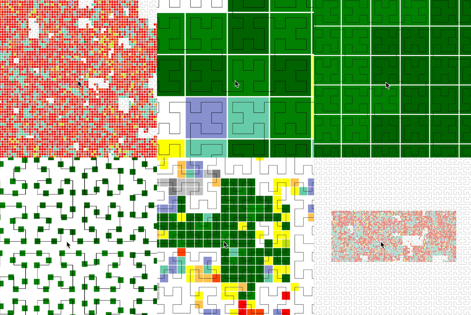
Recently I've had the opportunity to be involved in a fascinating research project whose goal is to create intuitive interfaces for massive amounts of genomic data. This research is led by Wouter Mouleman at the Altius Institute and it is a prime example of the type of problem I want to tackle.
While we are still in the early stages of development, I've already gotten to push every aspect of my data interface development practice. Whether it’s designing a new file format to efficiently access data mapped to anywhere on the human genome or prototyping new interactive visualization techniques, we are at the forefront of a new way of seeing our own DNA:
Hello, Python
In the process I’ve been refreshing my Python skills, something I now see as an essential complement to my JavaScript skills. Being able to process larger datasets into manageable pieces for the browser has been game changing. Of course, you can’t write a newsletter in March 2023 without mentioning ChatGPT, and it has been incredibly helpful speeding up my orientation in Python land:
Design by a thousand papercuts
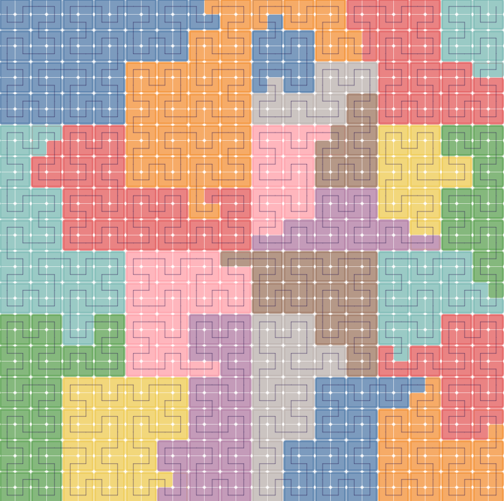
Mapping the genome isn’t just math and algorithms, it’s also about creating a place that people can visit. It’s about orienting yourself amidst torrents of data and being able to share a perspective that you have found. I realized that I couldn’t design just starting at the screen, so I printed the genome out on cardstock and cut each chromosome into a puzzle piece:
This exercise gave me an intuition for laying out the map and convinced me it would be worth it to make a digital tool for adjusting the layout:
While the layout is not yet finalized (this actually turned up new concerns we now need to address) I wanted to share this work-in-progress because it was both an effective way for us to move the design forward and it was a lot of fun to do!
Data Architect
I want to take a moment to plug my new favorite YouTube channel by Eric W. Reinholdt, an architect who documents his process beautifully. I feel there is a lot for data design professionals to learn from architects, and Eric’s videos are a free master class!
APIs need design too
One of the things I came to appreciate working at Observable is a well designed API. I got to see Mike Bostock and Fil design and build Plot commit by commit, and the design of that API is incredibly thoughtful and ergonomic, it's like a data visualization glove that glides right on to your brain and makes you faster and stronger without even thinking about how to use it.
Then there is the other kind of API, the (hopefully) RESTful kind that lets you fetch data from somewhere and offloads storage and processing to the server allowing you to focus on frontend interface development. A well designed API increases the potential energy of an Observable notebook by an order of magnitude. And I am still constantly making Observable notebooks for my clients.
StabilityAI API
The StabilityAI API is currently in beta, and you can use it to generate StableDiffusion images without needing a fast GPU in your computer. I’ve taken some time to familiarize myself with it and made a couple of notebooks that demonstrate how to call it from the browser. The first is a simple Text-to-image example which lets you write a prompt and submit it for generation. It’s a basic REST API call powered by a form.
The second notebook is as bit more interesting, as it enables Image-to-image generation:

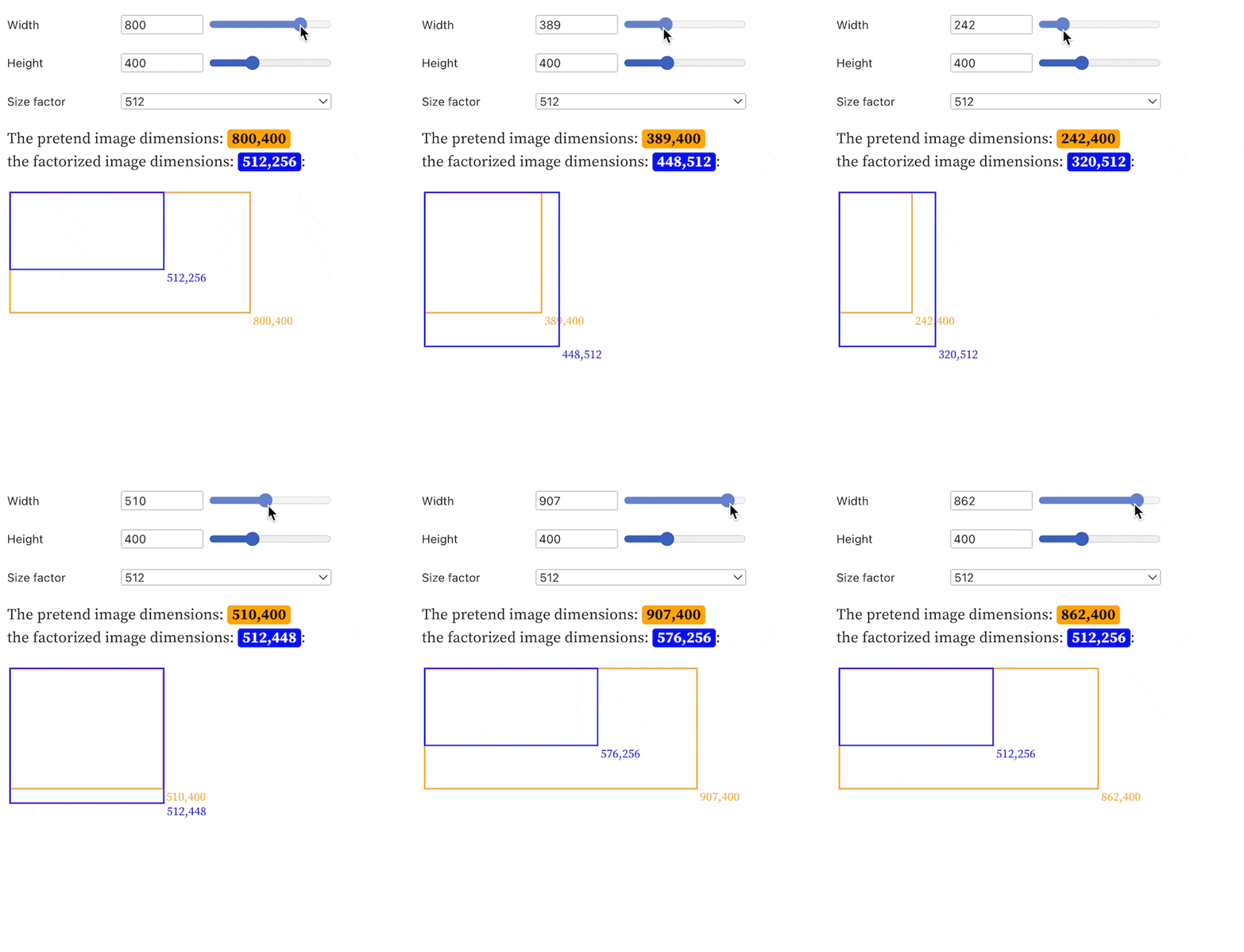
It’s interesting because in order to correctly call the API you need to submit an image in the right format (binary data) at the right size (width and height must be a multiple of 64). The binary part isn’t so bad, as HTML5 Canvas provides a canvas.toBlob() function, but the code to resize properly is a bit gnarly:
I had translated that code from a Python example and was curious to get an intuition for what it was doing. I always get nervous about resizing images and maintaining aspect ratios so I figured I’d make a little interface that let me simulate different image dimensions and see what the results would be:
You can play with it yourself near the bottom of the Image-to-image notebook.
Latent Interfaces
As you can see, these data interfaces can take many forms and involve a wide variety of tools and techniques. I’m excited to share more work in the coming months, especially a project I got to collaborate on with my main man EJ Fox and the data visualization studio he's starting!
I’m also contemplating making some YouTube videos that go into more detail and it’s extra motivating when people let me know. So please reply to this email if you want to see a more detailed video on any of these.
Thank you
I'd like to thank my close friends EJ Fox and Erik Hazzard for feedback on the newsletter and support in starting this new venture. I'd also like to thank my wife Agnes for her unyielding support and priceless insights.


Congrats!!! Looking forward to seeing your upcoming work!!
This is very interesting! I am looking forward to the next one!